Vicky Franken
Vicky, Karo, Sooji, gedichten, ontworpen verbinding, geschreven letters
Vicky, Karo, Sooji, gedichten, ontworpen verbinding, geschreven letters
Couldn't load pickup availability
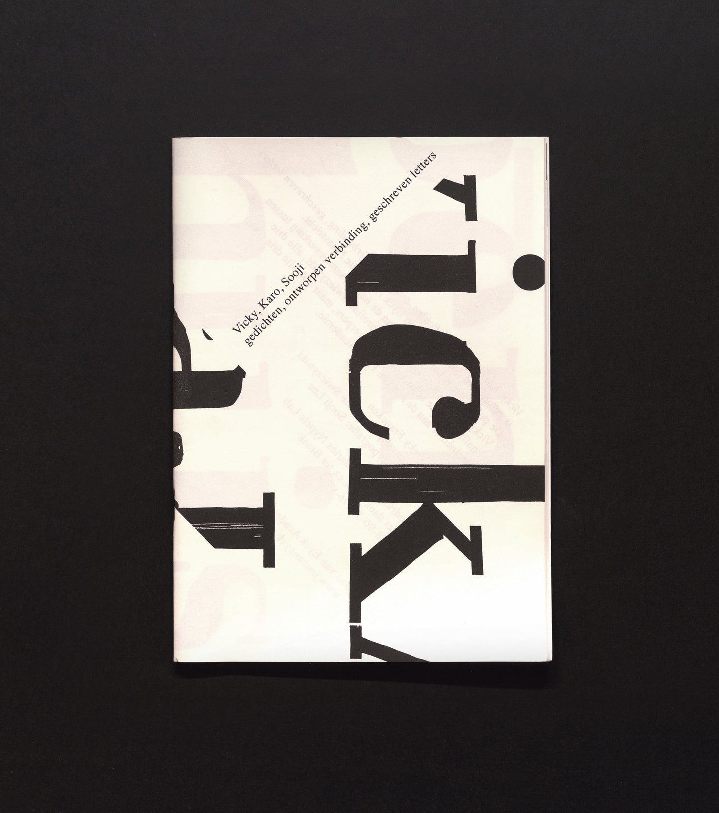
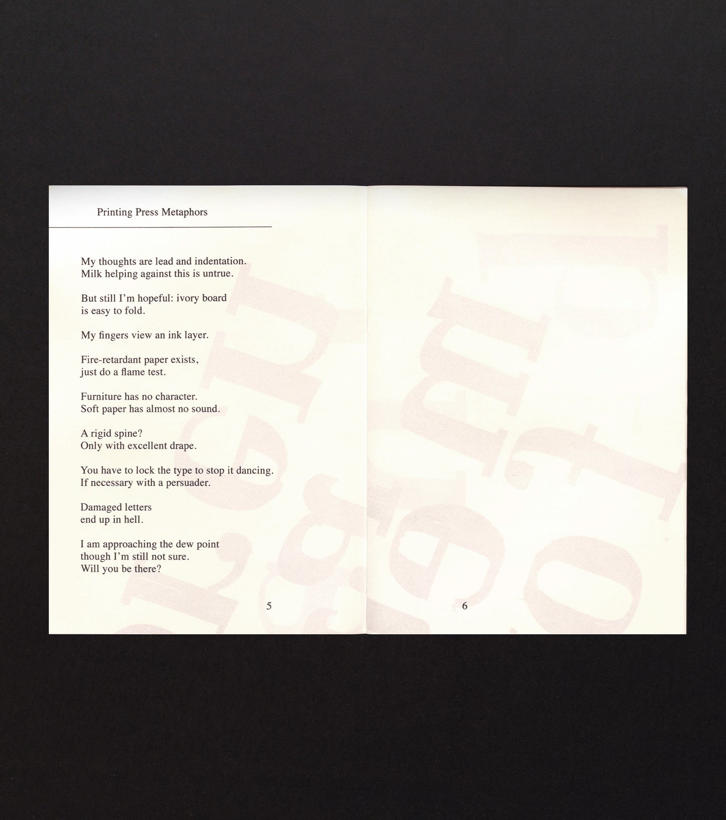
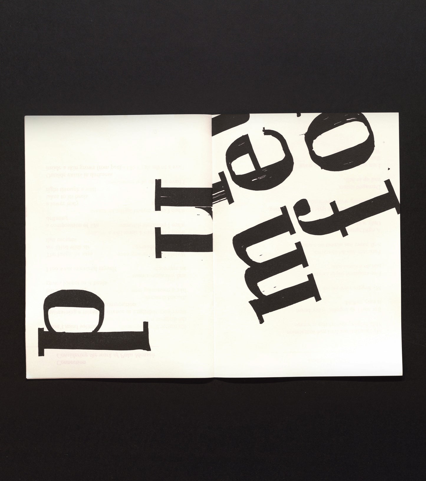
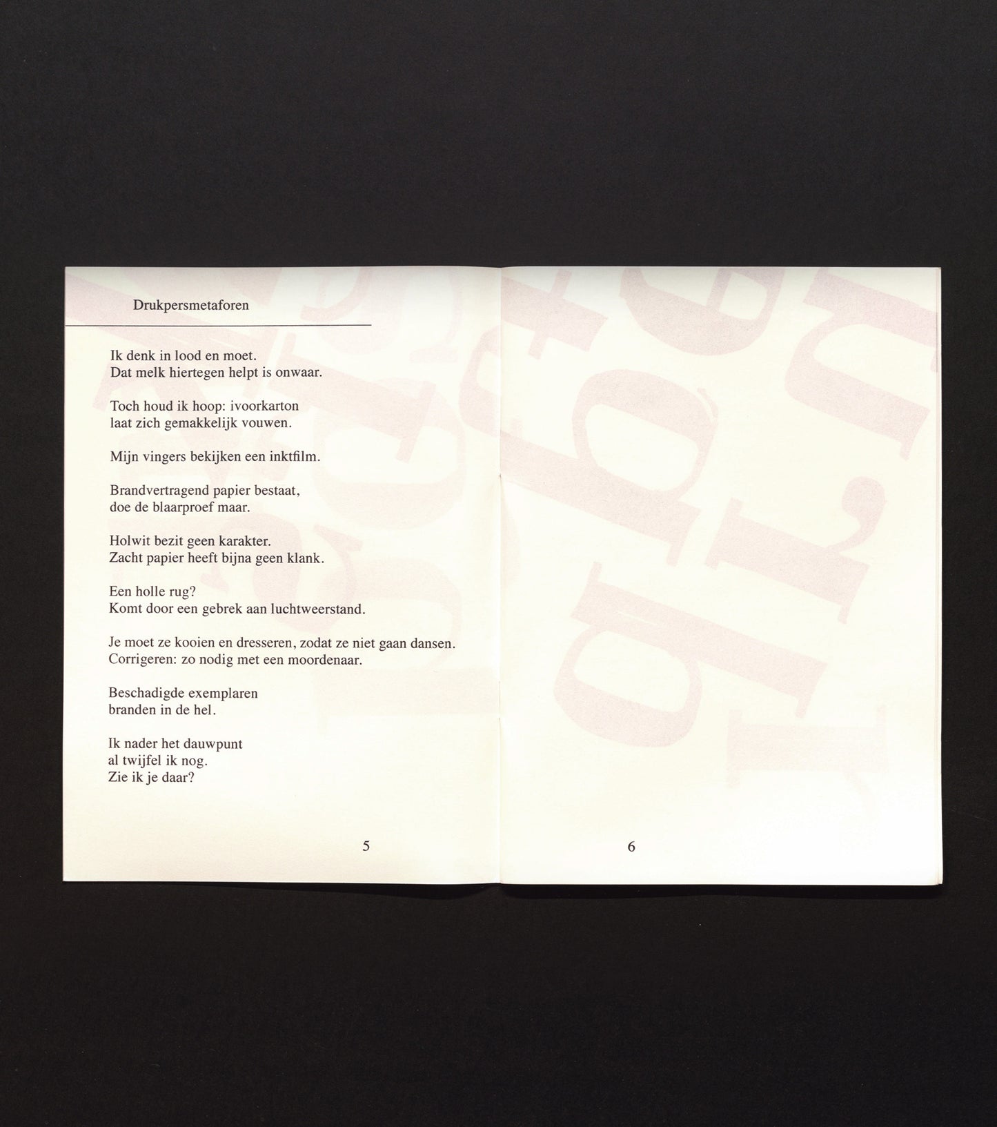
A collection laid out in a large font. The theme here is simplicity. Which means: a self cover of the same fine felt-like paper as the interior, all printed only in black, with illustrations in the form of hand-drawn letters; a cahier simply held together by two staples. This gives the book a nice activist feel. However, this little book proves that it is also possible to achieve richness, nuance and elegance eloquence using minimal resources. The fact that the staples are black is just one such subtle refinement; the theme of the cover – typography placed at a slant – is made all the more interesting by the likewise slanted text inside the cover which shines through, and so becomes part of the cover design. Here, black print on white paper – in this case off-white – comes across as a fresh idea, rather than the worldwide default. The solution for including two languages in the collection – each given its own half of the book, each revolved through 180 degrees in relation to the other so that each language can be read from the cover to the centre of the book – is a frequently used one, but here feels extremely natural and continues the theme of criss-cross typography presented on the cover. The three compilers (of text, graphic design and written typography) explicitly present themselves as jointly responsible for the whole, which reinforces the sense of ‘unity in layering’ that elevates this modest little book above mass mediocrity.
Author: Vicky Franken
Editor:
Publisher: Jan van Eyck Academie
Contributor(s):
Year: 2019
Pages: 18
Language: Dutch and English
ISBN:
Size: 19.5 x 27
View full details


OTHER BOOKS
—


